Onboarding walkthrough
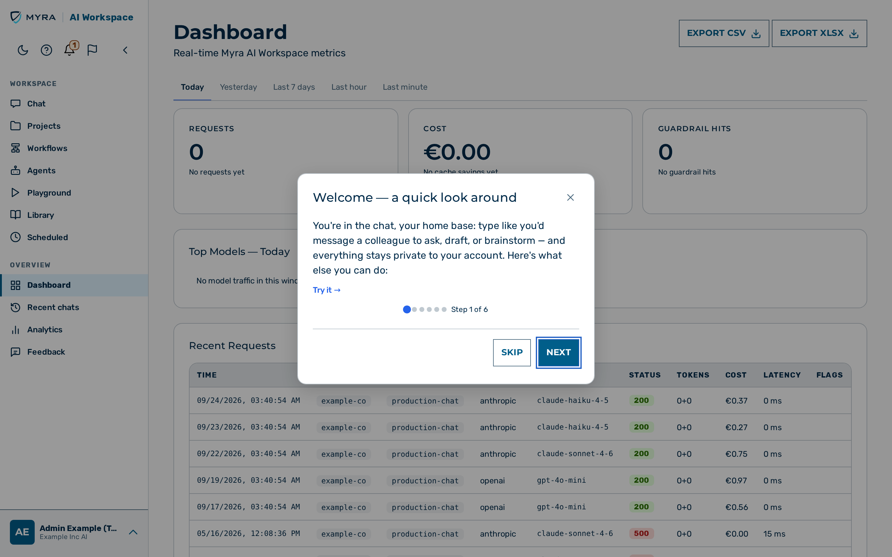
Description
The onboarding walkthrough is a short guided tour that introduces the workspace to a new user on the first sign-in. The walkthrough opens as a dialog over the first view the user reaches.
The walkthrough appears once per user. The workspace records that the user finished the walkthrough, so the walkthrough does not reappear on the next sign-in.
When the walkthrough appears
The walkthrough opens on the first sign-in, on the first view the user reaches:
- A member or viewer reaches the chat, so the walkthrough opens there.
- An admin or tenant_admin reaches the dashboard, so the walkthrough opens there.
The walkthrough does not open for the demouser role, and does not open on a public page.
Steps of the walkthrough
The walkthrough presents a short series of steps. A counter in the dialog header, for example Step 1 / 6, shows the position in the series. An admin or tenant_admin sees more steps than a member or a viewer, because the walkthrough also covers the management features.
The steps introduce the core features, including:
- Welcome — a quick look around — the chat as the home base.
- Organize with Projects — keeping related chats and files together in a project.
- You're in control of your data — how personal data is detected and masked before it reaches an external model or tool.
- Prompt Library — turning prompts into shared one-click shortcuts (administrators).
- Bring your team — inviting teammates up to the seat limit of the plan (administrators).
Each step shows a Try it action that opens the feature of the step and keeps the walkthrough available as a small guide beside it, so the tour is not lost when the feature opens.
Independently of the walkthrough, a new account (first seven days) also sees a one-line privacy hint under the chat composer before its first message on a Privacy on route — see Chat — Privacy hint for new accounts.
Navigating the walkthrough
The dialog header shows a counter in the form Step X / N. A progress bar in the footer shows how far the user has progressed: its segments mark the completed steps, the current step, and the remaining steps. Selecting a segment jumps to that step.
The walkthrough shows the following buttons:
- Try it — opens the feature of the current step. The walkthrough does not close: it moves to a small, non-blocking guide docked in the corner of the screen, so the user can use the feature while the tour stays available. The user finishes the tour from the docked guide (Skip or its close button). The Try it button is hidden when the user is already on the feature of the step.
- Skip — closes the walkthrough without opening a feature.
- Back — returns to the previous step. The button is hidden on the first step.
- Next — advances to the next step. The button is shown on every step except the last.
- Get started — closes the walkthrough. The button is shown on the last step.
When the buttons do not fit beside the progress bar (for example with longer German labels or in a narrow window), they move onto their own row below the progress bar. The dialog never scrolls horizontally.
-> The workspace records that the user finished the walkthrough, so the walkthrough does not reappear on the next sign-in.
Reopening the walkthrough
A user who closed the walkthrough can open it again from the account menu (the user block in the navigation): select Replay onboarding. The walkthrough reopens from the first step, even after the user has finished it. This entry point is available to every role except the demouser role.
💡 Note: A backdrop click does not close the walkthrough, so the user does not dismiss it by accident.